


Imagine signing up for a course you are genuinely excited about. You clear your schedule, open your laptop and immediately hit a wall. You cannot find the start button. The dashboard looks like a junk drawer of widgets, the login loops twice and the instructions sound like they were written for a software engineer. Within ten minutes, your initial spark of motivation turns into self-doubt: Maybe I am just not good at this. [epale.ec.europa.eu]
That moment is not a content problem. The curriculum might be brilliant and the instructor might be top-tier, but the experience failed before lesson one even started. Closing that exact gap is why Learning Experience Design (LXD) exists.
What Is Learning Experience Design?
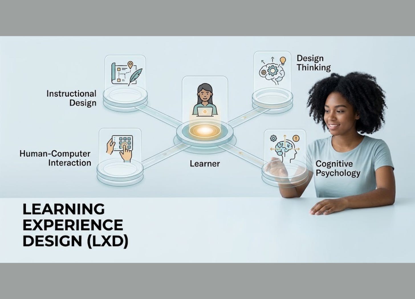
Learning Experience Design takes a ground-up approach to digital environments by starting with the human being, not the syllabus. It blends instructional design, human-computer interaction, design thinking and cognitive psychology to build digital learning that feels smooth, usable and worth returning to.
Traditional instructional design usually asks: What needs to be taught? LXD flips the script and asks: Who is learning, what do they actually need and how will this experience feel? As one expert panel noted, LXD centres on “learner-centrism” and relies on human-centered design practices to build these spaces. It moves the conversation from the raw material to the human experience. [par.nsf.gov]
This does not mean ditching old-school instructional design. The most effective programs combine solid pedagogical principles with smart UX thinking to keep people engaged. LXD simply builds on those foundations.
Why UX Is the “Silent Pedagogy”
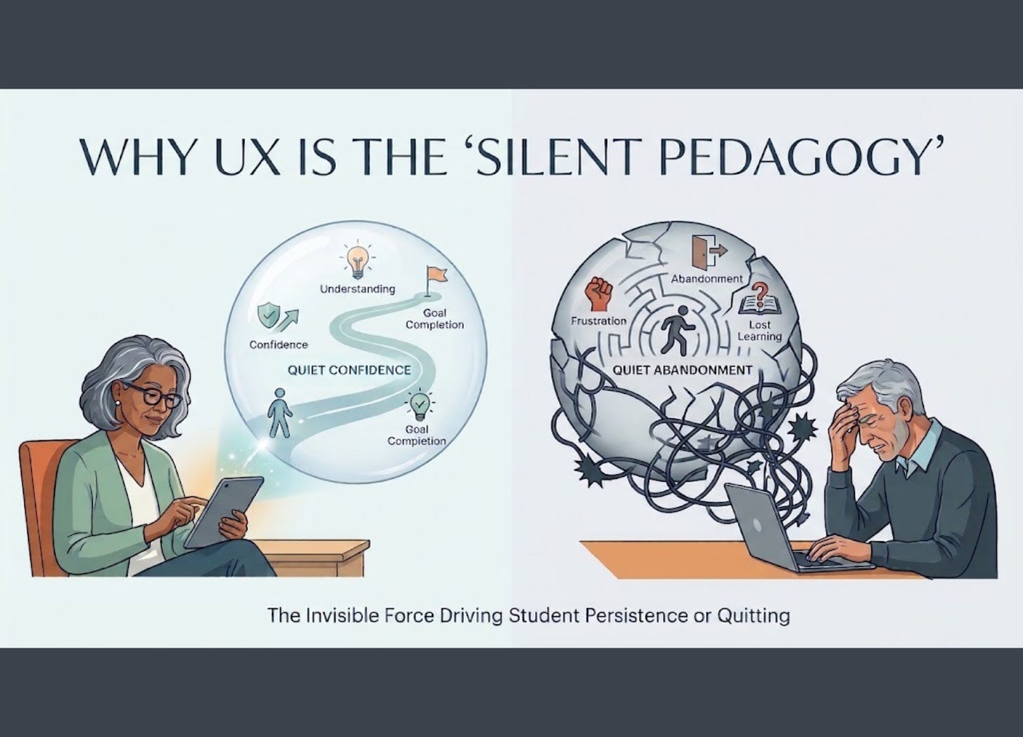
People often think User Experience (UX) is just about picking nice fonts, clean menus and attractive colour palettes. In an educational setting, it goes much deeper. UX acts as a silent pedagogy that quietly determines whether a person keeps going or quits. [epale.ec.europa.eu]
Cluttered interfaces do not just slow people down; they turn them away. When a platform feels like a puzzle, learners waste mental energy fighting the system instead of absorbing the material. For adult learners juggling jobs, family and razor-thin schedules, that added frustration often leads straight to abandonment. The story of a 50-year-old professional giving up after getting stuck on a login screen is not a hypothetical example. It is a design failure with a real human cost. [epale.ec.europa.eu]
The emotional toll is real. A thoughtfully designed system builds quiet confidence, while a messy platform builds frustration and makes people feel out of their depth. That emotional reaction is not a minor detail. It drives whether real learning happens at all.
The Three Elements of LXD
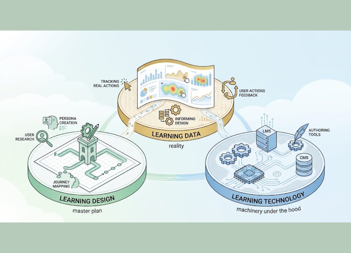
Building a great learning environment takes more than one skill set. Research from Unicon breaks LXD down into three core pieces: Learning Design, Learning Technology and Learning Data. [unicon.net]
Learning Design is the master plan. It defines who the learner is, what they need to achieve, how activities sequence together and what overall strategy keeps it coherent. This is where tools borrowed directly from UX, such as user research, persona creation and journey mapping, come into play to map out the learner’s journey. [unicon.net]
Learning Technology is the machinery under the hood. It includes the LMS, authoring tools and content management systems. The goal is to weave these tech layers together so seamlessly that the tools get out of the way. If a learner spends time thinking about how the platform works, the design has missed the mark. [epale.ec.europa.eu]
Learning Data brings in reality. It tracks real user actions like where people click, where they stall and which sections they revisit. That feedback shows designers if the course is actually helping. Without solid data, design decisions turn into educated guesses. [www.unicon.net]
What Good UX Looks Like in Practice
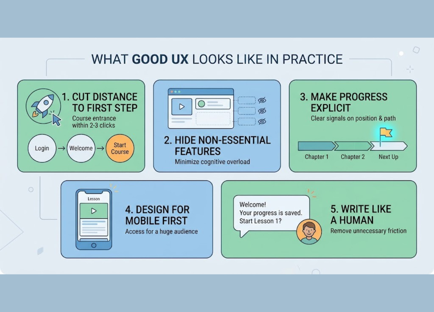
Designing a platform that feels completely natural takes focus and empathy. Here are five practical principles to keep in mind:
Cut the distance to the first step. A user should be able to jump into their course within two or three clicks.
Hide non-essential features. Dashboards stuffed with sidebars, promo banners and extra menus drain attention. Showing information only when it is needed keeps cognitive overload to a minimum.
Make progress explicit. People need clear signals showing where they are, what comes next and how far they have come. Wandering in the dark creates needless fatigue.
Design for mobile first. Many people study on their phones during brief pockets of free time. A system that only functions properly on a desktop desktop cuts off access for a huge audience.
Write like a human. Clear instructions and plain-English error messages are not “dumbing things down.” They are basic courtesies that remove unnecessary friction.
Why This Matters Beyond L&D

You do not need to work in training or corporate education to see why this matters. If you have ever used a language app, completed a work compliance module or taken an online certificate course, you have felt the impact of these choices. The decision to finish a course rarely comes down to content alone; it hinges on whether the environment respected your time and attention.
For organisations, bad design gets expensive fast. Every user who drops out over a confusing menu represents lost time, wasted budget and unnecessary frustration. For educators and developers, the takeaway is clear: good content is only half the battle. The experience itself is part of the teaching. If a platform makes someone feel incapable, no curriculum in the world can fix that.
The most effective learning platforms do not rely on flashy tricks or dense feature lists. They simply clear the path so people can focus on what actually matters: learning. [epale.ec.europa.eu]
Five Questions to Ask Before Building Any Learning Experience
Who is the learner and what state of mind are they in when they arrive? (Excited? Anxious? Pressed for time? Sceptical?)
What is the very first action they need to take and how many clicks will it take them to get there?
What elements can stay hidden until the user actually needs them?
How does the system show learners that they are making progress?
Where could the interface accidentally make someone feel confused and how can we fix that spot?